
Real-World HVAC Diagnostics: Catching Hidden Energy Waste with the Carpet Graph
Standard line graphs are great for spotting sudden temperature spikes, but they often fail to expose long-term, systemic inefficiencies. When an HVAC system misbehaves during off-hours, it can drain your budget silently. That is why Mervis SCADA includes a highly specialized visualization tool for facility managers: The Carpet Graph.
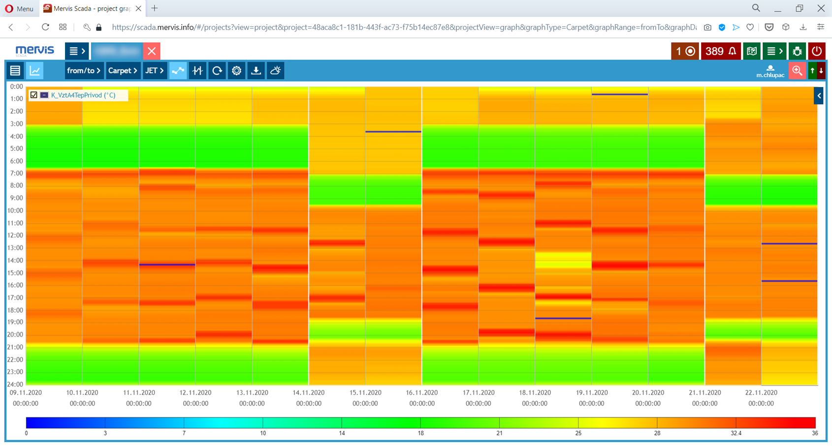
The Problem: The "Silent" AHU Heating Issue
Consider a scenario where an Air Handling Unit (AHU) is unintentionally heating a room from midnight until 3:00 AM. In a standard setup, this is incredibly difficult to spot. Because the office is empty during the night, no occupants will complain. By the time employees arrive in the morning, the comfort levels are perfectly maintained, meaning standard temperature alarms are never triggered. The system looks healthy on the surface, but it is quietly wasting energy every single night.
The Solution: Visualizing the Anomaly
Unlike standard charts, the Carpet Graph plots individual days on the X-axis and hours of the day on the Y-axis, creating a dense, color-coded heat map of your operations. When reviewing the month's data, the midnight-to-3-AM anomaly becomes blatantly obvious as a distinct color band outside of standard operating hours.
Key Benefits for Facility Managers
- Visualizing Schedules: Instantly verify if your heating circuit is actually obeying its scheduled night depression modes.
- Catching "Drift": Easily spot equipment that is turning on too early or running too late without having to dig through thousands of lines of raw data logs.
- Dense Data Analysis: Compress an entire month of complex status variables into a single, easily readable square, making long-term reporting effortless.
Helpful Links & Resources
- Technical Documentation: SCADA Graphs Guide